Sineath Wins Best Logo at the North Carolina Home Builders Gala
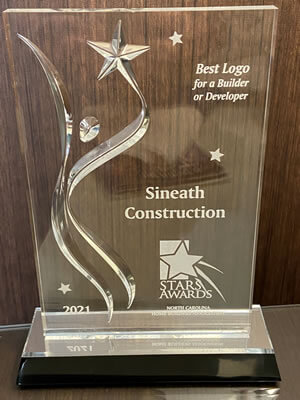
Best Logo at the NCHBA Gala
We won! Our new logo won the STAR Award for Best Logo for a Builder or Developer at the North Carolina Home Builders Association awards banquet on Sept. 22 in Charlotte.
As many of you know, last year we went through a process (you know how we are about processes) to create a new brand look for Sineath Construction. We placed our beloved name and existing logo into Karen’s, Rebecca’s, and Jen’s capable hands at Studio 88 to give us a new look – a new visual identity.
Brand Explained
Informed by the findings of Studio 88’s thorough brand study, the goal with our new Sineath logo was to create a bold, modern, and confident logo that reflects our brand attributes of respect for the mountains, integrity in our work and relationships, and attention to every detail.
The use of the mountains implies the importance of location when building, from building in challenging and steep locations to reverence for the land. The home implies integrity of work and an inherent integration of the structure with the landscape. Tying the structure to the name with a focus on detail, the bold sans serif font used as typeface reflects the same thickness as the roofline. The color palette represents the surrounding nature and was chosen for its gender-neutral qualities.
Thank you, as always for your support.

